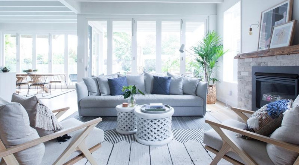
Interior designers know how to elevate a home’s style. And while Pinterest and Instagram keep our cups overflowing with #interiorsinspo, there’s nothing like styling tips from the experts themselves.
We chatted to seven interiors experts to get their best home styling hacks, surprising design habits, and tips and tricks to help you up your interiors game.
Interiors hack: Choosing the right white
Shilpa Mohan from DDC Architecture + Interior Design says “Choosing a white for your room can be easy if you remember which white to use with the direction of the sun. An east or west-facing room needs a neutral white with grey/blue and yellow undertones. A north-facing room needs a cool white, and a south-facing room needs a warm white.”
Style hack: Choose the right white for your room by considering the direction the room faces.
Style Tip: Get the rug right, and the rest will follow
Donna D’Paul from Köntrast says, Ever wondered why some spaces look ab-fab and others are lack-lustre? There are a few tricks to transforming interiors such as layering, lighting and styling with the correct scale of furniture.
However, our absolute essential base to all living room spaces is the application of floor rugs. Even if you already have carpet, a rug can help to zone a space and introduce texture, colour and interest. The trick is to make sure it is either noticeably darker or lighter than the floor surface and sofa.
With so many varieties available, the right size, tone and texture of a rug can dramatically elevate the appeal of any interior.
Style hack: Floor rugs are essential to living room spaces, even if you already have carpet.
Wall art idea: Use artwork to draw the eye
Mornington Peninsula-based interior designer Samantha Dunne from Dunne Interiors says, Artwork makes a great styling piece within the home and doesn’t have to be looked at as a standalone piece that hangs on the wall.
It can be as simple as resting a piece on a console or buffet. Look to create a vignette by clustering a collection of items next to or in front of the artwork to give it place and purpose and avoid it looking like it’s just been dropped and forgotten.
Style hack: Artwork can elevate a room, but doesn’t have to be relegated to the walls.
Storage hack: Make the most of the kitchen island
Lauren Tanner from Brisbane-based architecture and interior design studio, Tonic Design, says: The double island bench is a great way to give you more kitchen space if you have minimal wall space but a lot of depth – it is also the perfect opportunity to introduce more drawers which are much more user-friendly and storage-efficient.
Cupboards on both sides of your island bench can offer great opportunities for added storage, too. On our recent project, the wine fridge and the cabinetry on the opposite side of the island bench provided great space for storing items that you regularly use at your dining table.
Style hack: Make the most of your kitchen island with storage on both sides – a nice idea is to pop a wine fridge on the dining side, for easy access to your wine collection. How fancy!
Style tip: Throw some shapes
Laura Downie from Sydney-based Studio 1 Interiors, says: Most living rooms have a lot of rectangles and squares – it’s simply the nature of those bigger furniture items such as sofas, sideboards and shelving units.
If you notice your space has lots of lines and right angles, think about adding some circles. It may sound simple, but it’s my go-to trick when a space feels too boxy. Try it! A round coffee table, a pair of round side tables, a round rug, a round wall hanging or mirror… the options are endless and the impact is huge!
Style hack: Living room feeling a bit boxy? Try adding some circles. The curved shapes will break up the lines and right angles and soften the space.
Design trick: Go for green
Property stylist Courtney Younie from Allure Property Styling says, Natural and neutral tones are simple to work with and can make a property look chic. But if you’re after a pop of colour, greens are usually a safe bet because they’re found in nature.
There is something timeless about the colour that’s calming and easy on our eyes.
Style hack: Keep it neutral to appeal to the majority of potential buyers, and if you feel like adding colour opt for green.
Bathroom hack: Matchy-matchy materials
Victoria + Albert marketing director Jonathan Carter says: Consider matching your bath and basin for a cohesive look. Baths and basins that naturally complement each other exude a synergy that creates a clean and balanced space.
You can choose to use monochromatic white and black or minimalistic colour palettes like muted grey and pebble tones. Remember to also consider the view from the ground up – if you choose a traditional claw foot tub in classic white, consider metal feet finishes to match your tapware and fixtures.
Style hack: Matching your bathtub and basin creates synergy in the bathroom, making for a clean and balanced space.
